Galleries

Narrated Visualisation – Russian Modernists


While considering a subject for a project on data visualisation, in order to make the research as relevant as possible to my overall course objectives, I decided to focus on three prominent Russian artists of the early 20th century. Kazimir Malevich, Vladimir Tatlin and Alexander Rodchenko were all important figures in the Russian avant-garde movement of the 1920s. Each working in a variety of art disciplines, generally in the style of geometric abstraction, their work has been highly influential on many artists in the west throughout the 20th century, and they have been the subject of a considerable amount of critical writing outside of Russia. In order to trace the trends of the writing that exists about these artists, I used Google Books Ngram viewer, Google’s online search engine that allows users to search for the frequency of occurrences of particular words in a given language.

The diagram above shows the results of a search for the three names, in the English language corpus, from 1920 (roughly when they first became prominent) to 2008. The graph shows a pretty steady increase of references to all three and then a tailing off, with Tatlin and Rodchenko being particularly equivalent in pattern. There is a marked peak for both around 1990 – 1991, probably related to the collapse of the Soviet Union at that time, which would have afforded Western academics increased access to their works. Also after this point many works from all three artists would have been allowed to travel abroad for the first time in decades to galleries in Europe and elsewhere, generating considerable interest. Another reason for the similarities in Rodchenko and Tatlin’s graphs may be that they were both associated with the same movement, Constructivism. Many books have been written about this specific movement and both would very likely be referenced in such works.

Kazimir Malevich has followed a somewhat different trajectory, remaining a prominent subject for discussion well into the 21st century. He is associated with a separate movement, Suprematism, in which he is by far the most notable figure. He was himself a prolific writer, and among the reasons for his increased popularity may have been the publication in the late 1990s of several volumes of his writings with English translations. There was a major exhibition of his work in Paris in 2002, followed by major retrospectives in Berlin and New York in 2003 and 2004. Such exhibitions generate a good deal of attention and renewed critical writing. In 2014 the Tate Modern gallery in London held a very sucessful exhibition of his work, so his prominence is likely to continue for some time.

I wanted to experiment more with the data from the Google Ngram Viewer. While it’s a great source of information and a very useful tool, I wanted to be able to play around with how the information looks visually, especially given my interest in fine art and aesthetics. There are many good tools available for data manipulation, but I was keen to try a more hands-on approach, so I decided to use the open-source programming language Processing, specifically developed for coding within the context of visual arts. Since my dissertation is likely to heavily feature its use, I also needed to gather more experience with it.

Malevich & pals 1

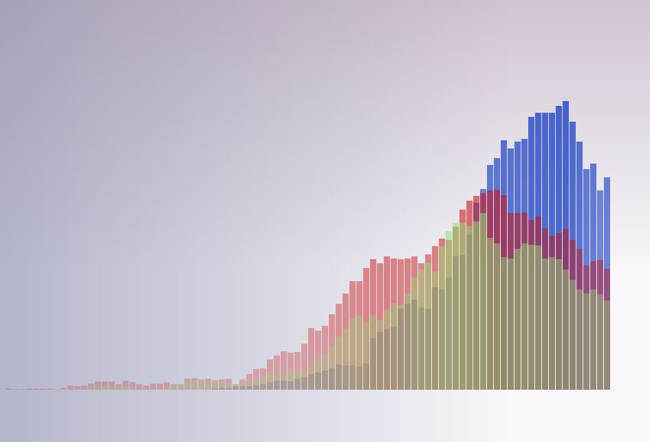
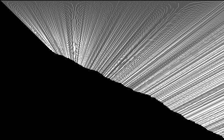
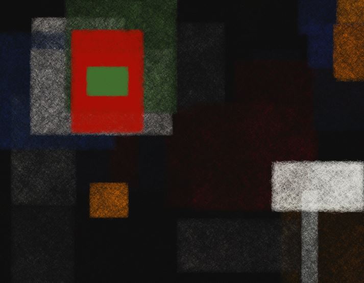
The above diagram was generated with Processing, and contains the same data from the ngram viewer with a different visual approach. The first task was to get hold of the raw data from the graph. Google Ngram Viewer doesn’t appear to have any means to be able to download the data from an individual graph, but I discovered that by viewing the source code of the webpage, the data existed as a distinct array for each search term on the graph. I was then able to insert the information into three separate arrays in my own code. This was a useful exercise as I hadn’t used or written an array before, and I understand the use of arrays will be important to produce sketches with good quality interactivity as I intend to do.

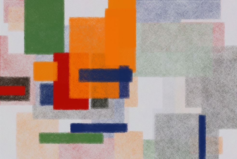
I used the data from the arrays with a for loop to draw the bars with varying length. For clarity, I retained the same colour scheme for each artist used on the Google graph, though I adjusted and desaturated them for aesthetic reasons. I also tied the opacity of each bar to its length, so the colour fades out with lower values, allowing the ones behind to be seen. This also produced a subtle modulation of colour across the graph. Finally I added a couple of for loops to produce gradients in the background for a little more atmosphere, and to contrast with the rigid geometry of the bars.

Malevich & pals 2

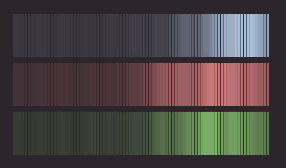
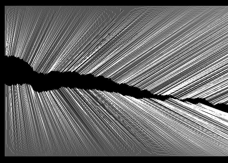
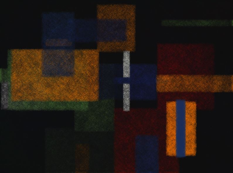
I was particularly interested in the variation in opacity I was able to get from the data, so decided to write another sketch to exploit this further, seen in the diagram above. Here, there is no variation in the length of the bars, but the difference in tone against the dark background has been exaggerated to produce a sort of contour effect.

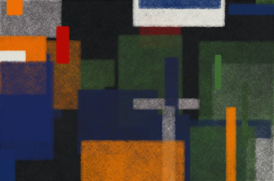
My visualisations currently have no textual information of course, so arguably have less functional use than the original Google graph. However, in visual form all the raw information is still present, and my goal was to focus on the aesthetics to produce something which could on some level be thought of as an art piece. This was a good learning exercise. It was fascinating to see that when you have the ability to acquire and properly store and retrieve information, it gives you a lot of control over how you present it.

Screenprinting Instructional Notes

Screenprinting

Screenprinting is a process used for both fine art printmaking and also in the textiles industry. It is particularly suited for use with photographic imagery, but there are also many non-photographic ways to use the process too. A screen consists of a frame, usually made from aluminiun, over which has been stretched a fine synthetic mesh which is glued in position. Ink can be forced through this mesh with a squeegee onto a surface underneath, which is typically paper or fabric. A squeegee consists of a rubber blade held in place within a wooden or aluminium handle.

Processing the screen

The screen is first treated with a chemical degreaser and dried, which cleans the mesh thoroughly. Assuming a photographic image is to be processed, a coating of photographic emulsion is then applied to the screen using an aluminium trough. This coating is sensitive to ultraviolet light, and the degreasing ensures the emulsion will adhere well to the mesh. The screen is now thoroughly dried. The artwork to be exposed onto the screen is now prepared. This is normally an image printed out on a laser printer on acetate or copy paper. Inkjet prints are not so suitable as the ink is far more transparent than the toner used in laser prints, and wouldn’t expose the image as well. If the image is printed on paper, it should be oiled with vegetable oil and blotted thoroughly to make the non-image areas transparent.

Exposing the screen

The artwork must now be exposed onto the screen using an ultraviolet exposure unit. The artwork is placed face up on the glass surface, the screen placed on top and then the vacuum pump should be activated. This ensures that the glass, mesh and artwork are clamped tightly together for an accurate exposure. The screen is now exposed with the UV light. The light passes through the glass and artwork and hits the emulsion. It hardens the emulsion where it gets to it, but the dark areas of the image prevent the light from passing through, and these areas are not hardened. The length of the exposure will vary depending on the result needed and the model of exposure unit. The screen is removed from the unit after exposure.

Washing out screen

The exposed screen is now brought to a wash-out booth and sprayed with a pressure washer. The pressure should not be set too high for this. This will remove the emulsion where it was not hardened by the UV light, forming the stencil for printing. A certain amount of control over the tones in the image can be had at this point by applying higher pressure water to areas where the image needs to be darker. The sreen is now dried and is ready to be printed.

Printing the screen

The screen is now either clamped onto a vacuum table for printing, or attached to a table top using jiffy clamps if one isn’t available. Assuming you are using a table, first attach spacers (a thin piece of wood or pieces of card) to the near edge of the screen so that the entire mesh is a few millimetres above the table’s surface. This spacing is called the snap and is important for good printing. Next tape off the areas of mesh around the image you are to print so the ink doesn’t flow into parts of the screen where you don’t want it. Apply a generous line of ink on the near side of the image. The consistency of the ink can be controlled with thinners. If the ink is too thin it will flow over the screen uncontrollably, and if it is too viscous it may dry too quickly and clog the screen. Holding the screen slightly up from the table top with one hand, push the ink gently across the printing area with the squeegee held in the other hand. The squeegee should be almost upright. This is called flooding the screen. Ensuring there is a piece of printing paper underneath, now print the image. With the screen placed fully down, grip the squeegee in both hands and place the blade down on the mesh behind the ink (now above the image.) Holding it at about a 45 degree angle, firmly pull the squeegee across the image towards you. This should have forced the ink from the mesh onto the paper below. Flooding and printing can be repeated with fresh paper as many times as needed. The position of the paper can be marked on the table top with masking tape if you wish, or a piece of acetate hinged onto the table with masking tape can be used to register the image. When finished printing, remove the excess ink from the screen with a piece of card and return it to a container. Wash the screen with water and a sponge to remove the rest, and dry the screen before printing again. The squeege should also be cleaned.

If a new stencil is to be applied to the screen, a stripping agent is used to remove the old emulsion as washing it with water won’t remove it. The screen is then degreased and the entire process repeated. Screenprinting is very suitable for printing images where many colours are layered over each other to create complex images.

Etching Instructional Notes

Etching

(All photography by John Beasley)

Etching is a form of intaglio printmaking. Intaglio refers to a method of printing from a plate into which recessed lines or grooves have been made. The printing ink lies in the groove below the surface of the plate where it is picked up by the paper when run at high pressure through an etching press. this differs from say, a woodcut where the ink sits on the upper surface of the plate and the cut away areas don’t print. An etching is produced by covering a metal plate, generally steel, zinc or copper with an acid resistant wax. The image is then drawn into the wax using a scriber or other tools exposing the plate underneath. The plate is then submerged in a bath of acid and the exposed lines are etched downwards by the action of the acid. The depth of these lines is dictated by the amount of time you leave the plate in the acid. There are many variations of this technique but all work by allowing the acid to only affect selected areas of the plate.

Copper etching plate and resulting print

Plate preparation

Before the plate can be etched it needs to be prepared and degreased.

1. File all four sides of the plate and round the corners, finish off with fine sandpaper for a smoother finish if you wish.

Filing the edges and corners of the plate

2. Degrease the plate by cleaning the surface thoroughly with a non-abrasive detergent, such as Cif, and allow to dry. It is also common to use a mixture of ammonia and french chalk, or a soya sauce solution.

3. Apply the ground on the hot plate with a roller (or brush if it’s a liquid ground) as evenly as you can and allow the plate time to cool down.


Grounds

There are two main types of ground; hard and soft. Hard ground is very suitable for fine, accurate lines and crosshatching made with a scriber. It cools into a dry wax coating on the plate. Soft ground always remains soft and tacky on the plate. It is useful for pressing fine textures into the plate by placing textured materials on top of the plate and passing it through the press.

Textured objects placed on a copper plate with soft ground

It can also be used to produce a soft, diffuse line by placing a piece of paper over the plate and drawing with some pressure over it to remove areas of the ground below.

Etching your plate

When you have finished your drawing, your plate is ready to be etched. It is first backed with contact or parcel tape. The plate is soaked in the acid bath for the desired time. As a general rule, heavier, firmer lines will be achieved by longer times. Etching times are generally reduced for a soft ground as the desired effects are often subtle and the ground isn’t as resilient. If using a nitric acid solution with a hard ground, it is good practice to periodically use a feather to brush away the bubbles which form on the surface for a more accurate etch. As acid is corrosive care should be taken when using it and suitable protective equipment should be used. When removing the plate from the acid bath it should be rinsed thoroughly with water before being removed from the acid room. When the plate is etched enough, remove the ground with white spirits and remove the backing. The plate is now ready to ink up and print.

Printing the plate

Cover the plate fully with ink, pushing it into the lines thoroughly with a piece of card or rubber squeegee.

Applying in on the plate

Remove the excess ink from the surface with a piece of scrim formed into a pad. Flat pieces of tissue can be used to polish the plate to make tones lighter and lines more crisp if desired. More selective polishing can be achieved by using a cotton wool bud or a fine cotton rag.


Clean off the edges and print the plate on an etching press with dampened paper.

Aquatint

This method of etching is used to produce areas of tone on your plate. It can be used in conjunction with line etching or alone. A fine layer of resin dust is fused onto the plate with a burner. When acid is allowed to etch through this layer, over time it forces the particles of resin further and further apart. The longer the plate is etched, the larger the gaps between the particles becomes and the darker the resulting print will be. When working with aquatint the tonal values of your image should be worked out in advance, as you will need to protect the plate at different stages of its tonal development, using bitumen varnish or some other acid-resistant material. Aquatint is commonly used on copper or zinc. It can also be used on steel, but as steel is a porous metal it will produce a tone when etched even without the resin layer, though the results won’t be as reliable.

The steps for producing an aquatint are;

1. Degrease the plate as usual.

2. Agitate the resin in the aquatint box by spinning the cranking handle.

3. Wait a minute or so, allowing the lumpier resin to fall. When the door of the box is opened, a fine cloud of dust should be visible.

4. Place the plate inside the box. Leave for a few minutes to ensure a decent coating.

5. Remove the plate carefully from the box so as not to disturb the resin.

6. Put the plate on the burner stand. Apply the flame from the Bunsen burner. Slowly pass the flame along, watching for changes in the colour of the resin, which indicates that the resin is melting and adhering to the plate. Do not leave the flame too long in one spot.

7. Allow to cool and remove from the burner stand.


The plate is now ready to work on. Begin by stopping out areas that you intend to be white. Use bitumen varnish, oil pastels or other suitable acid-resistant materials. Back the plate and immerse in the acid bath to achieve your lightest tone. Remove from the acid and dry. Next stop out the areas where you want only the lightest tone to remain. Put the plate in the bath until the next darkest tone is reached. Remove and stop out the areas where you want this tone to remain. Continue in this way until you have etched all tones onto the plate up to the darkest. Keep a note of how long the plate has been in the acid for in total. Usually a test strip is prepared and printed in order to judge how long the plate needs to be etched to achieve a desired level of tone.

Working out a plan for the various tones with desired times

When this process is done the plate can be printed. First remove the varnish etc. with white spirits. Then, usings methylated spirits, remove the remaining resin thoroughly. The plate can be inked up and printed as normal, taking care to wipe and polish tonal areas gently.

Spitbite

This is another form of etching generally used with an aquatint. It allows the artist to produce tonal marks that are similar to watercolour or ink washes, by painting the acid solution directly onto the plate instead of immersing it in a bath.

The tonal range available from spitbite technique

It is best to use a ferric acid solution on copper to do this, as it both gives the best results and is safest, as ferric acid is less dangerous to use than nitric.

Ferric-chloride spitbite solution

To use this technique prepare the plate exactly as above for aquatint (steps 1-7) Next, using a brush, simply paint the acid solution onto the plate and it will begin to etch immediately. It can be applied directly, or pooled into water for gentler effects. To achieve dark tones, the acid will need to be replenished on the plate several times and allowed to sit for some time. With experience you will learn to judge the levels of tone you are producing. The solution should be washed off when finished. As you are still using an acid solution, care must be taken and protective gloves should be worn to protect yourself. Before printing remember to remove the resin layer with methylated spirit.


Sugar lift

Sugar lift is a technique which allows you to  apply a solution directly to the plate and form a stencil only from the areas where you have painted it. This has the advantage of allowing you to work in the positive, as opposed to having to stop out areas of the plate which will be protected from the acid, which effectively forces you to “paint around” the areas to be etched.

The solution is made from a mixture of gum arabic into which has been dissolved a small amount of sugar, typically castor or icing sugar. Some water-based ink can be added to increase the visibility of the marks. The solution is applied to the plate with a brush or other tool and allowed to dry thoroughly. A layer of hard ground is then applied over the plate, ensuring all areas are well covered.


The plate is then immersed in a bath of very hot (almost boiling) water and this should have the effect of expanding the solution and removing the ground which is immediately over it, exposing the copper underneath.

Immersing the plate in very hot water

The bath can be agitated to remove all traces of solution for a clean result. On a copper plate, this is typically used when an aquatint has already been applied so that a full range of tone can be etched through the stencil to achieve the desired effect.

Newly formed stencil, ready to be etched with aquatint already on the plate

OpenStreetMap

OpenStreetMap is a free to use, collaborative mapping project continually updated by a large community of contributors worldwide.  As it is open data, it is allowed to be used for any purpose, but has come to play an increasingly important role in the area of humanitarian aid. In the aftermath of the 2010 Haiti earthquake, it was quickly used to build a very complete digital picture of the terrain, buildings and roads in the worst affected areas, proving an invaluable resource to aid workers in the region. Since then, primarily through its tasking manager site, humanitarian crises are tracked and prioritised so the large number of subscribed mappers can use satellite imagery and other resources to get important geographical information to aid workers on the ground.

OSM1

I recently set up an account with OpenStreetMap in order to begin contributing to the project. The prospect of getting to grips with the tools was a little daunting at first, but there are some excellent tutorials and introductory videos available on openstreetmap.org which I found to be a great help. Despite the gravity of the work being done the tutorials successfully get across how much the organisers want people to become involved, stressing the value of even a minimal level of involvement, which I found very reassuring.

The process of becoming a contributing mapper is essentially quite simple. After having signed up to the project, you are free to begin contributing to the map of any part of the world you like, by simply searching for the desired location, and choosing to edit it, which can be done with a set of intuitive mapping tools accessible from within your browser. The user interface provides several tools which you can use to add information of different types to a map. With a little practice these provide the means to intuitively trace out and identify a full range of geographical features including houses, roads, residential areas, coastlines and so on. Additional information on the mapped features (if known to the user) can be added using a panel on the left of the screen. I found the interface responsive, uncluttered and user-friendly, with handy keyboard shortcuts mapped to many of the more commonly used functions.

OSM2

Having practiced a little with the tools I visited the OSM Tasking Manager at http://tasks.hotosm.org/ in order to contribute to the ongoing humanitarian work. I decided to work on some regions of the map of Botswana, particularly in Mochudi and Sephare. For each region, there is a detailed description of the type of relief work being carried out in the area and instructions on the particular geographical features to be prioritised. In Botswana, there are many parts of the map where buildings and roads have not yet been marked out. This information is vital to facilitate the ongoing treatment programs which are tackling the high incidence of HIV/AIDS and TB in the country. I’ll admit to a strong initial sense of apprehension before beginning the mapping process,  after all, this work may well have consequences in the real world. However, the process is truly collaborative, and there’s a strong sense of support there. Firstly, the regions are divided into tiles of a manageable size, which can be further subdivided into smaller zones if needed. Secondly, you can save your work at any time and come back later. The tiles are also validated and modified if necessary by more experienced mappers when they are declared finished, (who may well possess more detailed local knowledge), so you never feel that you are working alone.

As part of my current MA in Digital Arts & Humanities, it is my intention to develop a series of interactive, web-based activities in order to teach people about the principles of design in fine art paintings, with particular reference to the geometric abstraction genre. Although OpenStreetMap is an entirely different proposition, I think aspects of the experience of working with it will inform my research. In particular, for any project requiring user interaction, a well designed, easy to grasp user interface would seem to be vital. Enabling the user to render virtually any type of geographical feature they may encounter would seem to be a very complex problem, yet the OSM interface manages it with just three simple buttons, allowing you to work with points, lines and areas. Each of these behave in distinct ways, providing contextual visual feedback to the user.  Also, there is a tiered structure to the information a user may enter. A traced line may be designated as a road, river or fence, but a road may be further categorised as any one of a number of types of road, and be named. This allows a contributor to engage with the map at a level appropriate to their experience and knowledge. Though my project will hardly feature this level of complexity, I can see how these would be important issues to consider in the design process of any interactive environment.

Also, while using OSM, I was reminded of the work of game designer Jane McGonigal, whose TED talk “Gaming Can Make a Better World” was part of the prescribed content for the Models, Simulations & Games module I’m also taking. In it, she points out that in online multiplayer games such as World of Warcraft, people exhibit certain types of behaviour and attitudes towards solving problems and achieving goals. These include very positive attitudes such as “urgent optimism” – the willingness to throw oneself into a task with great enthusiasm, “blissful productivity” – the feeling of satisfaction that comes from being engaged in hard work, and a willingness to team up and collaborate  with a large community in which you place great trust. She is concerned that these attitudes don’t appear to be as prevalent in reality, and argues that if we could harness gamers’ energy and apply it to actual world problems we could make great progress. Having initially heard her arguments, I concluded that while they were intriguing and well intentioned, they exhibited a degree of naivety. However, having used OpenStreetMap, and sensed all of these attitudes at play there, I now realise she may be on to something.


Sketchup & Google Earth

This was an experiment with using 3d modelling tools to recreate artworks and to locate them in a virtual space. I used the freeware 3d modelling software Sketchup (formerly Google Sketchup) to model versions of physical artworks I’d previously made and exhibited. This was a good exercise in getting to grips with Sketchup, which is a pretty powerful and user-friendly tool. I also indulged in a little blue-sky thinking, and fabricated a very large public sculpture too, eventually making an entire outdoor sculpture pavilion for myself!


As Sketchup’s original use was to enable people to upload 3d models of buildings to Google Earth, I was able to preview my work within that environment, all I had to do was provide a location. I decided therefore, to locate my pavilion in the grounds of the world’s tallest building, the Burj Khalifa in Dubai (why the hell not?)


Unfortunately, I was only able to view the work on my local machine, those picky Google Earth people not being inclined to include objects online that don’t actually exist. It was fun though.


Experiments with Programming

In 2013 I was particularly interested in exploring the nature of the decision-making process of making art, and the idea of authorship generally. I began to experiment with allowing aspects  of physical artworks to be generated by chance. I started by throwing dice and using other games of chance to decide the length and directions of various lines I would draw on a wall. Soon I realised that computer programming could be an ideal replacement for this, since it can be programmed to generate randomness, and also seemed to me to provide a more active agent in the decision-making process. I had a few early attempts with applications running an old programming language called BASIC, which I’d played about with as a teenager on an old Sinclair computer.


I was able to generate a few interesting things by setting up loops which would run repeatedly and draw sequences of lines, some of the coordinates being randomized by the computer. I wanted something which would allow me to interact more with and influence what was happening on the screen. I soon discovered Processing, an open-source programming language, and did my best to get to grips with it. I wrote some code which made a grid, and plotted lines from one point to another with each key-press. I had made a similar physical grid on a wall with screws, and used coloured wool to trace the design exactly as the computer directed me.


I was able to change the variables in the code to make the program favour particular regions of the grid, or make diagonals etc.


I later tried to write programs that allowed the user to generate their own imagery, giving them a degree of control over where elements were placed by clicking regions of the screen, but having the computer randomise aspects of the design. This one, for example, would place a rectangle of random dimensions and density where the user left-clicks, while right clicking darkens and partially erases what is already on the screen. The colour is randomly generated from a set number of options, to give a sense of aesthetic consistency.


This was interesting, as the user has a lot of control over aspects of the design, but encounters an element of risk in adding to a composition the they might like. An unexpected shape or colour may throw off the balance of the  work. In this way the interaction with the program becomes a sort of game, with elements of reward and penalty depending on the outcome.


Dimensions, Location Variable

DLV is a modular, interactive, open-ended artwork I made in 2013, consisting of several hundred wooden components which can be assembled together in many different ways. I first exhibited it as part of the final show for for the Crawford School of Art & Design fine art masters program. It was designed over the course of several months, and each piece was individually cut with a band-saw  and assembled by hand.


The idea of the piece was to challenge the static, finite status of most artworks, and to explore the nature of creative authorship and decision-making. Essentially, rather than make an individual artwork, I wanted to create a system for art creation, with a number of possibilities for construction, that I, or someone else could use to create their own artworks. During the exhibition, which ran over the course of two weeks, I changed the configuration of the work nightly.


As part of the exhibition, I invited a group of Interior Architecture students from St John’s Central College Cork to interact with the piece for one day, allowing them to create whatever they wanted out of the pieces, which would remain in place for the next day. They ended up making a Christmas tree (it was that time of year!) and a model of a penny-farthing bike. It was a fascinating exercise in which I got to see what other people, from a very specific background, would do collaboratively with the work.


The piece reappeared in 2014 in the Cork Film Centre Gallery, Ballincollig, as a collaboration with Cork-based artist Cassandra Eustace. I made a dome-like structure from the components, and Cassandra projected a moving image piece onto and through the structure, and added additional reflective elements. In the fully light-proofed gallery this made for a very fluid and dynamic installation.


“Unfold” Exhibition & Discussion

On 30th January, 2016, the West Cork Arts Centre, Skibbereen hosted a questions and answers session with with the six participating artists in their current exhibition “Unfold”. The artists were myself, Johnny Bugler and Rosie McAuliffe – members of Cork Printmakers fine art print workshop, and Cork County-based artists Simon English, Sarah O’Brien and Rob Monaghan. Also present were Ann Davoren, director of the centre and Valerie Pentek, director of CorkPrintmakers. The project was funded by the Cork County Council Arts Office, and the participating artists had been awarded their places by a selection panel on the basis of written applications submitted earlier the previous year.

The preparation of work for the exhibition had begun in the Summer of 2015, when all six artists had come together for an intensive two-week residency in the Cork Printmakers workshop. During this time, the aim was for myself and the other two Cork-based artists to provide tuition in printmaking techniques to the other three artists, who in general had little experience in the area, in order to allow them to explore print within their own practice, and possibly make a body of print-based work. There was no expectation of this however, and although all six artists ultimately had printed work in the show, there had been no expectation of this on the organisers’ part. The only obligation was to deliver a show in the venue with work from all six artists, coming out of the collaborative process, with no other themes set or specific curatorial input.

The residency in Cork had been extremely busy and productive, and we’d ended up giving the three visiting artists a thorough grounding in pretty much all the major print techniques, including screenprinting, relief, lithography and etching (both traditional and photographic.) We’d had concerns along the way that this amount of information may be a bit overwhelming, but the visiting artists’ appetite for knowledge was insatiable, so we kept up the pace! By the end of the fortnight a great deal of work had been completed to a great standard, with all the artists really getting to grips with the methods and techniques. A lot of decisions were quickly made about what aspects of print worked for them individually, and what parts of the processes and methodologies were maybe not so relevant to their work. The option was also there for the artists to come back after the fortnight and spend more time finishing and refining their projects, which they did.

The show in the West Cork Arts Centre opened on 15th January 2016, and was a very diverse collection of work, comprising projected and screen-based video, painting, mixed-media installation, and a large amount of printmaking of many different types. It took place over both floors of the gallery, with the six artists’ bodies of work being split up and allowed to flow into each other, and distributed over the entire space, giving a good sense of continuity between the two main exhibition areas.


Installing  “Unfold” at West Cork Arts Centre

The artists discussion was a nice addition to the program, and was very well attended, with a lot of good input and thoughtful questions from Valerie Pentek, Ann Davoren and the audience. It ran for the best part of an hour and covered a lot of ground, but a few issues in particular came out of it that stuck with me.

An early question was asked about the motivations the artists had for taking part in the project, and the answers ranged from an interest in showing work within the architecture of the building, to a desire to learn about the particular processes of printmaking, and also a more general interest in the artists expanding their general experience of collaboration.

Some good points were raised about the nature of working within the very specific environment of a busy printmaking workshop, and what effect that had on the experience of making work, particularly for the county-based artists. It was generally agreed that it was a positive experience, with one of the artists stating that he wanted to immerse himself in this experience as much as possible, enjoying the often ordered, sequential approach needed in some of the techniques. Others remarked that they found this aspect of printmaking to be more of a difficulty, and could have done without some of the more time-consuming, labour intensive aspects. The Cork-based artists made the point that this was one of the more challenging aspects of the residency, trying to find techniques which would cater to the visiting artists’ particular interests and working habits, which was a matter of some trial and error.

The more general point was made that the experience was very good in terms of forcing all the artists to consider ways in which to push printmaking into areas not traditionally associated with it, and to tackle the still widely held misconception that it is a form which remains strongly tied to restrictive historical conventions. All three Cork-based artists’ practices incorporate aspects of printmaking but with a heavy emphasis on installation, video, sculpture and mixed media works, and all agreed that they benefited from the opportunity to expand further on this. It was emphasised that although it is important to learn the methodologies of printmaking well, it should never be treated in a precious way and should be adapted to whatever a particular artist’s needs are, and that aspects of it can be a very responsive and immediate if required.

Everyone agreed that the projects and exhibition had been  well planned and organised and had been a very rewarding and worthwhile experience to be involved with.


“Unfold” opening and my installation “Gunpowder Wall”

User-Centred Design

In essence, this is a set of design principles which prioritises the user, and the nature of the user’s experience of the product during the design process. A key point is that the user, as the end target of the design process, should be involved at every stage along the way. Also, the philosophy is that the manufacturer should design a product that the user would need and want to use, not try to convince them to use something they don’t want.

There are 6 principles set out that should ensure a design is user-centred –

  1. The design is based upon an explicit understanding of users, tasks and environments.
  2. Users are involved throughout design and development.
  3. The design is driven and refined by user-centered evaluation.
  4. The process is iterative. (contains procedures which can be repeated to get better results)
  5. The design addresses the whole user experience.
  6. The design team includes multidisciplinary skills and perspectives.

The UCD idea seems to be mainly applied to the development of software, and the development of websites in particular. A major part of the process is the “rhetorical situation”, and in this case the rhetoric appears to be whatever message you want to communicate to your audience.  The rhetorical situation has three components; audience, purpose and context.

“Personas” are developed as archetypal focuses of the design process. They are a sort of distillation of all the types of people the design is aimed at all rolled into one person, from information gathered from interviews. There’s also a secondary persona, and even an anti-persona, to represent the kind of people you’re specifically not aiming your design at.

“Scenarios” are produced where a period of time or sequence of events is played out in written form, with the personas appearing as characters within them. They can represent best case, worse case or  “meh” case situations. Since the personas are given names and backstories, the idea seems to be that the people designing the product have a more concrete point of reference for their target audience and can work in a more informed way.