I have known artist and writer Corina Duyn for several years and have long admired her ability as an artist, and particularly her commitment to remaining so productive while having lived with the illness M.E. for many years.
When she approached me with an idea for a puppet-based project “Reflection” I was immediately intrigued. Corina’s concept is to have two identical puppets, one intended to represent a reflection of the other as though in a mirror. While one of the puppets will remain quite stationary, the other will be designed to move and dance, either by being manipulated by a performer or animated through the use of a small motor. The outcome of the project is expected to be a short film, but we are open to the possibility of other forms as well. According to Corina, this piece will explore the duality experienced while living with an illness – the reality of reduced physical mobility contrasting with the complete freedom offered by the mind and the imagination.
While Corina busily works on the two puppets to be featured in the piece, she has asked me to explore the idea of using motors to animate the dancing puppet. We started off by buying a small motor kit from an electronics shop, and I began to experiment with getting it running and seeing what it was capable of.
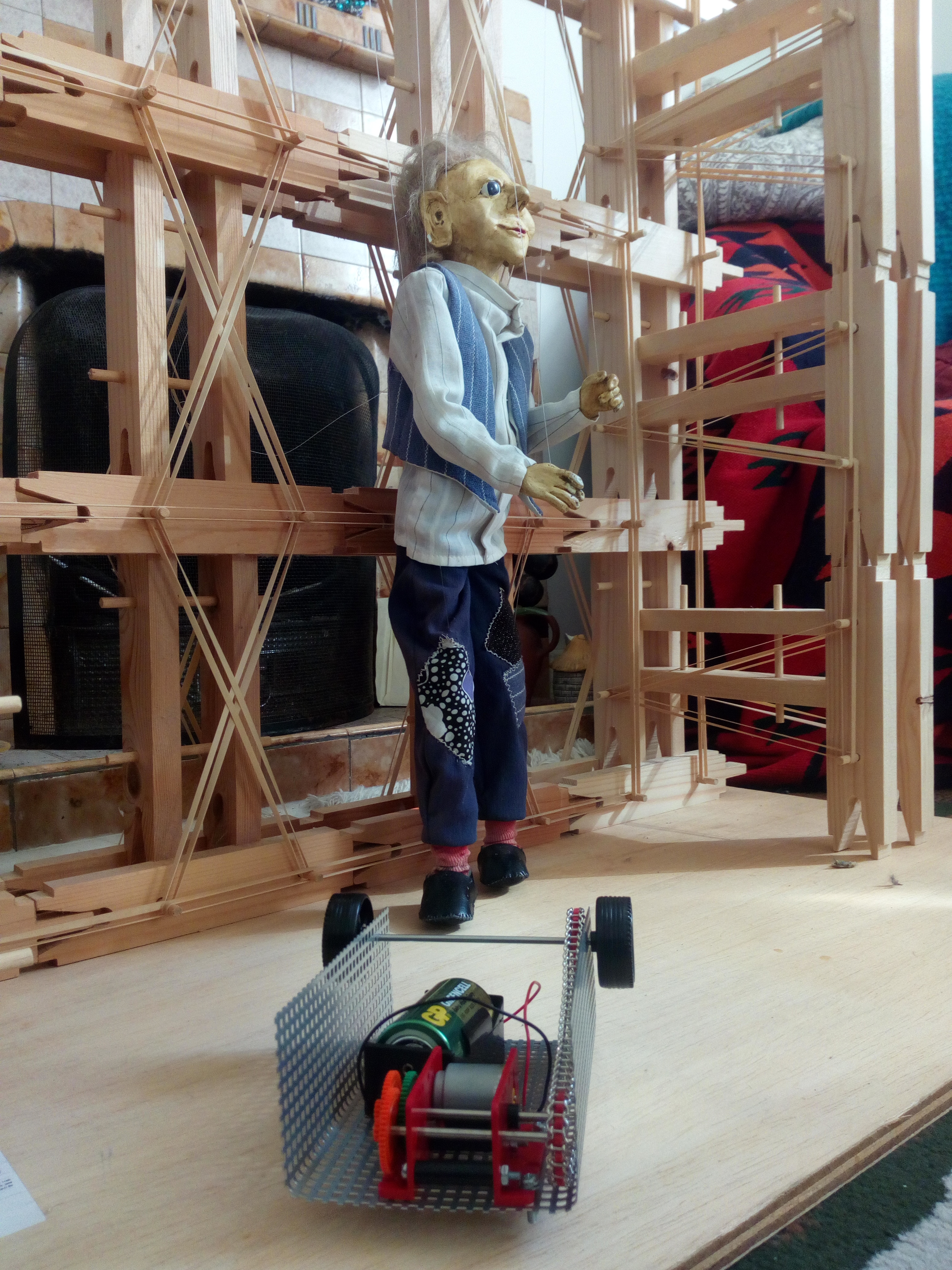
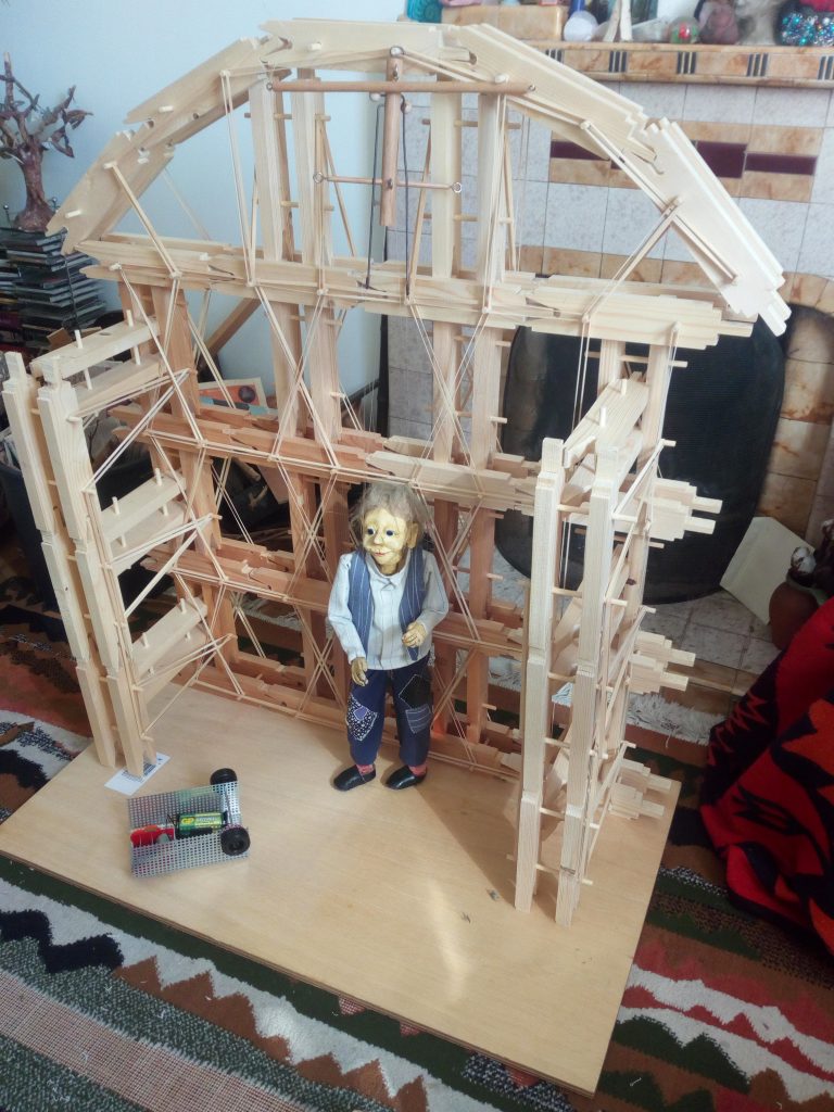
In some early tests, by using the motor together with a combination of small hooks and twine, I was able to get some movement into Jimmy (a puppet Corina had made some years ago, but very similar to the ones she’s now working on.) So far I have been able to animate his arms and upper body at a slow speed. In the future I hope to be able to get a greater range of movement into his arms and also legs to give a more convincing and fluid sense of movement by connecting the motor to different parts of his body. I would also like to explore having different areas of his body move in such a way that they do not necessarily remain in sync with each other, so that the movement isn’t repeated constantly on a loop. This would hopefully make the animation more interesting to observe.
-
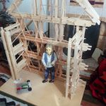
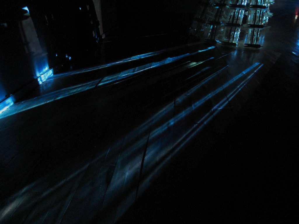
- Jimmy on stage
-
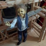
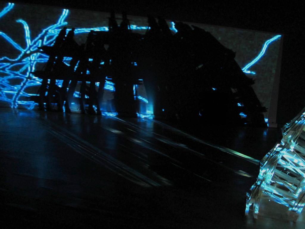
- Jimmy moves..!
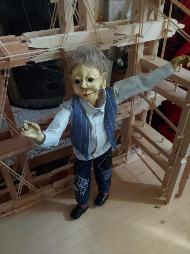
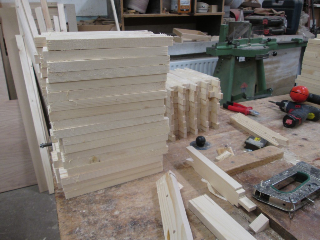
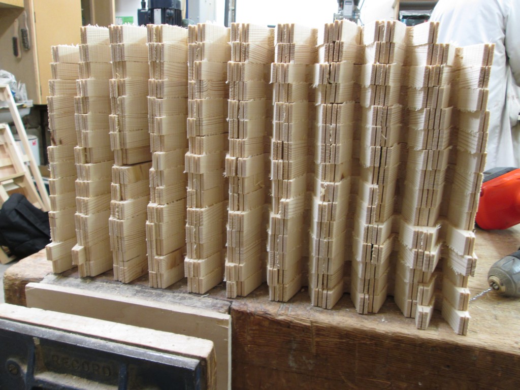
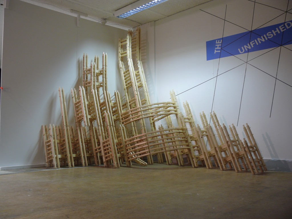
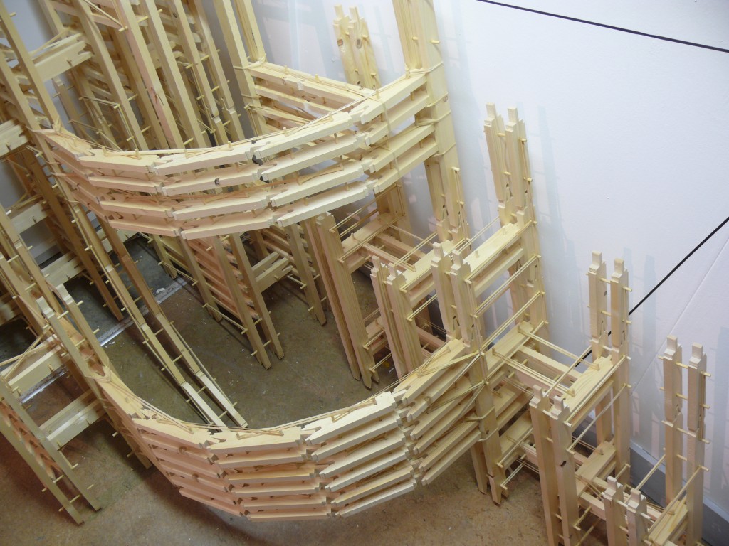
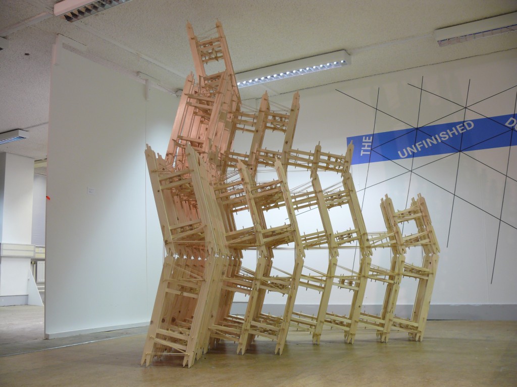
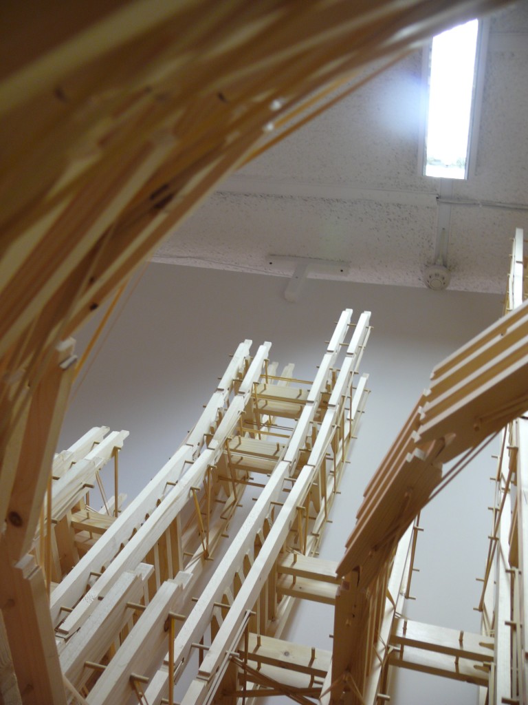
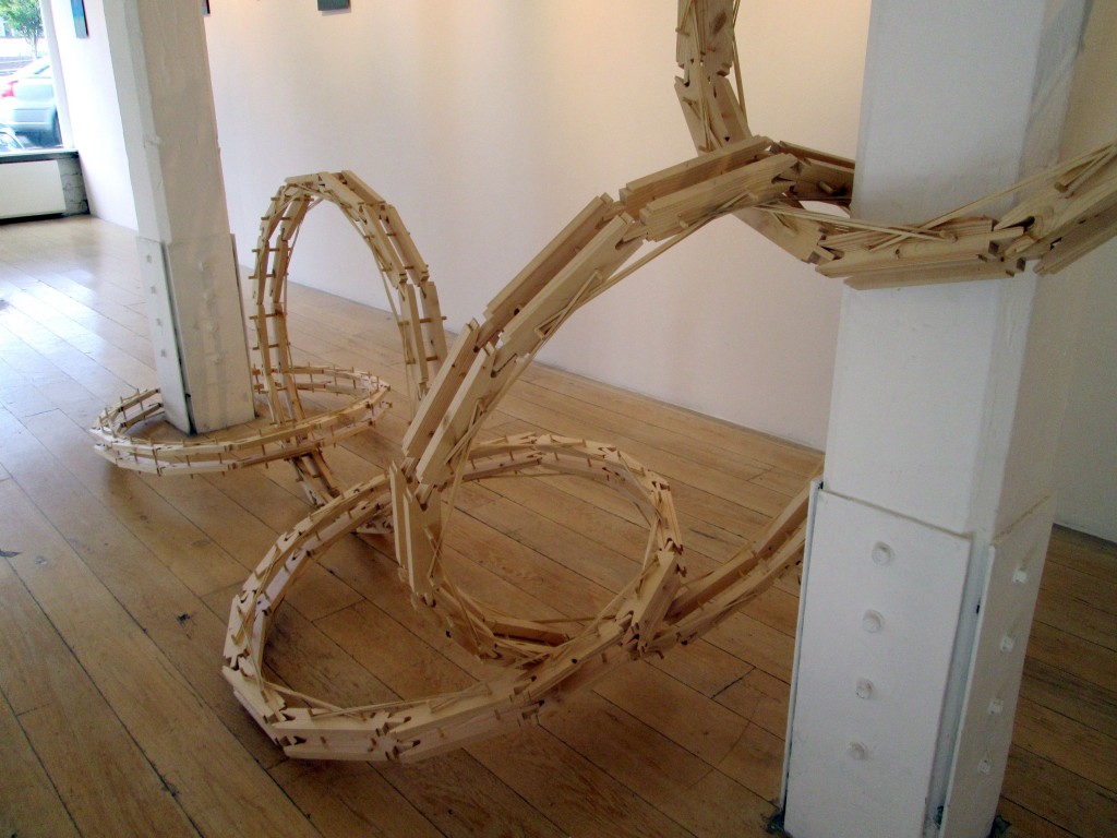
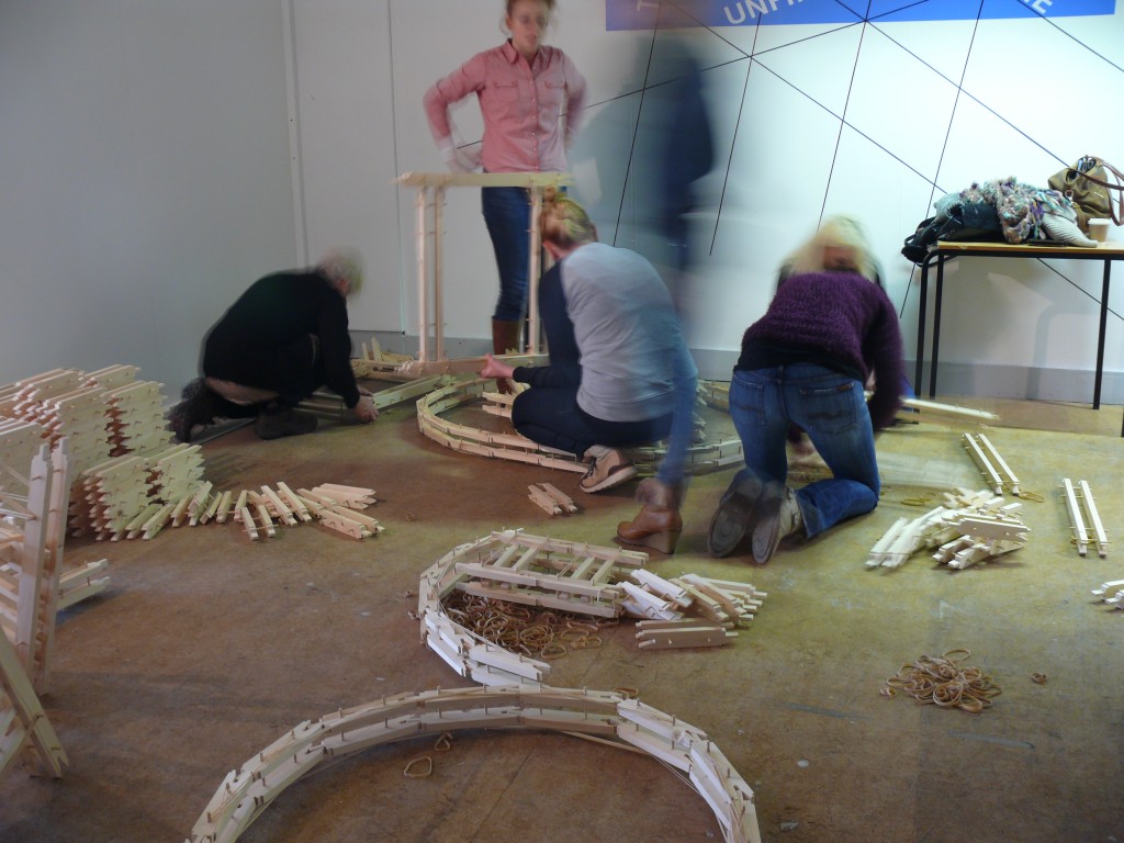
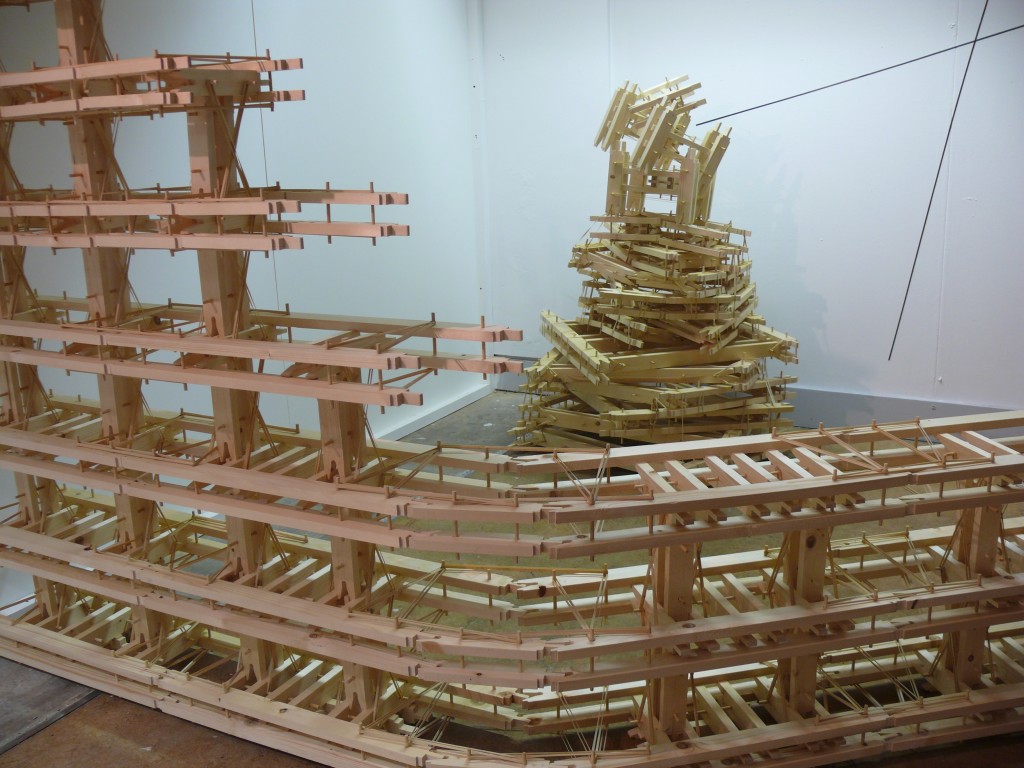
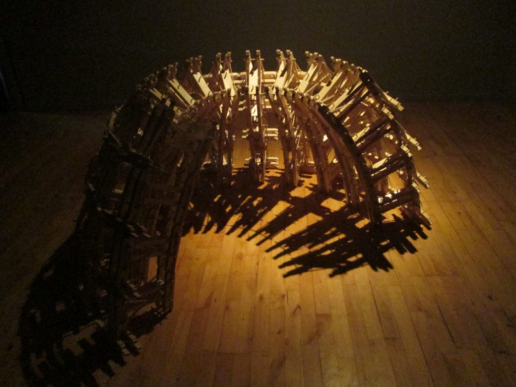
An important issue to address while working on the piece was to find some sort of structure in which I could suspend Jimmy while exploring his movement. To do this I hit upon the idea of resurrecting a modular sculpture I’d made a few years previously, called DLV (Dimensions, Location Variable). This is a “kit” made from several hundred identical interlocking components, used for making a range of artworks, which I’d always intended to use repeatedly in different situations. While initially planning to use it as a temporary measure, it soon became clear that the simple timber and dowelling aesthetics of the piece were a very good match for the materials Corina had used to fashion Jimmy and the cross from which he is usually operated. We are now considering using it in whatever form the project finally takes.
I’m delighted to be working on this project with Corina, and look forward to seeing where it takes us!